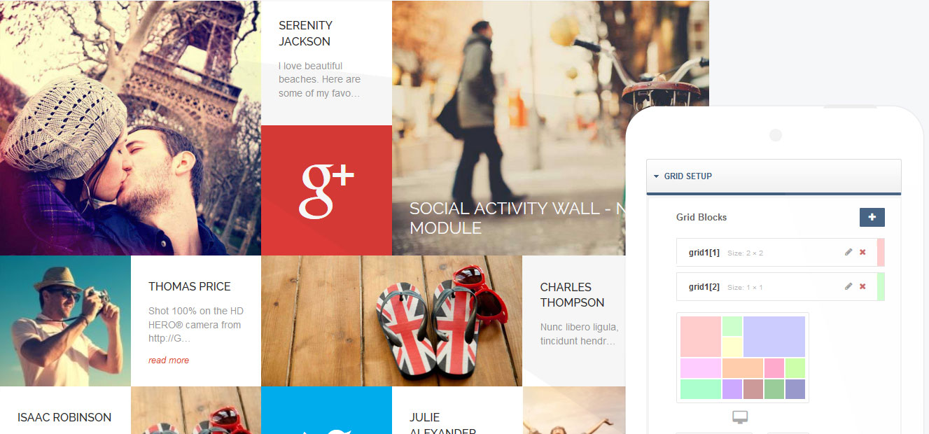
Metro Grid Joomla module
Enter the modern era of touchscreen-friendly responsive web design. Metro Grid takes your module content and displays it in a stunning grid pattern that adjusts in real-time to match your screen size. A stunning module for appealing to audiences on both desktops and mobile.
Grid layout for your popular module content
Highlight your full range of content, from articles to social media streams, video embeds or plain text and images, all in a package that encourages custom setups. Metro Grid simplifies the design process so you can manually define each grid block's size and position for desktop, tablet and mobile screens so you know exactly what your customers will see no matter their preferred device for browsing. Free to download and use, Metro Grid is a beautiful tool that sets the trend for the contemporary metro layout.
No limits to what your grid can promote, whether simple text or complex module
As with our useful Tabs extension, Metro Grid takes your diverse module content and applies it into a visually-impressive showcase, but instead of tabs, you'll get one of the big trends of the ever-improving web design world; grid layouts. Each grid block can be individually customized; display images or text with a custom HTML block, or utilize any of GavickPro's other powerful plugins to add post previews, social streams or weather apps. There's no restrictions on what you can show, so take advantage and get a look that shines far above your peers.
Responsive web design makes Grid perfect for all mobile devices
Worried that your grid will lose its impact on a small screen? Don't be! The amazing features integrated in Metro Grid are designed to use the available screen size to its advantage. Desktop, mobile and tablet each have their own specific layout to distribute your content effectively without losing the aesthetic appeal a grid provides. What's more, you can directly control each block, setting its size and position as needed on each screen type, so there are no nasty surprises when you come to test your new look.
Simple, understandable custom layouts
Creating your grid is simplicity personified. Options let you select the size of a block, and you can then add it in a clear visual interface so you can tell where the block will go and its alignment before saving changes. It will even show you how the block layout will translate to smaller screens, and you can change these smaller layouts individually to perfectly match your website vision.
Display the full range of media and social connections
As the world gets faster internet access, the desire for expansive media content grows. Grid is ready to go; embed Youtube videos, display photos, even highlight social network streams. Since Grid can display module content, all you need is the right plugin and your site can be completely unique. Don't lag behind the pack; download the package in minutes and start making your site spectacular immediately!
What's new?
- v.1.0.108/11/2013
- Added support for Joomla! 3.2
- Updated on
- 08/11/2013
- Version:
- 1.0.1
- Compatibility:
- Joomla! 3, Joomla 4
- Layout:
- Responsive
- ★
- ★
- ★
- ★
- ★
