Introduction
The Box Joomla! 3.5 ecommerce template is designed to do more than facilitate sales; with a fresh touch-friendly layout that transfers effortlessly between desktop and mobile screens, readable fonts and typography and informative boxouts and images all wrapped up with Virtuemart support, it can help you sell a lifestyle; building a brand that matches your core product demographic.
This guide explains the key features included with the template, and provides an in-depth step-by-step process for installing the quickstart package for new sites, or manually configuring the template on an existing Joomla! installation.
Installing the Box Template
Before starting your installation the most important step is to decide whether you can install Quickstart package, which will automate the installation of the latest version of Joomla!, the template, modules, menus, demo content and database data to match the demo layout of the template, or if you should use the more time-consuming manual installation, which will allow you to update an existing website without removing any content. Which method you should use rests on the current status of your site; if you're starting a brand new website or your existing site is relatively new with little custom content, then the quickstart installation will get you up and running fast. However, since it is a full Joomla! installation this method may only be used on a clean server; it cannot be installed in an existing Joomla! installation.
If you have a mature site that has a lot of content that you'd rather not migrate to a new installation, or if there is custom content that cannot be backed up and restored, then the manual installation would be the preferred install solution. This method will allow you to keep the existing content, but develop the layout and features included with the Box template to frame them in a new and exciting way. This can be especially useful if you already have an extensive product catalogue in Virtuemart, for example. With the included modules you can simply assign your existing products to the frontpage product showcases. However, the major drawback of this installation method is that it is time-consuming; without an automated install it becomes necessary to manually place and configure each of the module used in the template in order to match the demo, though of course this does allow you to modify the content as you go rather than changing the demo content after install.
Generally we recommend the quickstart installation if possible, especially if you're fairly new to Joomla. Though configuring modules is not a particularly tough task, if you are not comfortable with the process then there will be a lot of double-checking needed to ensure you are getting the settings correct. Once you have decided on your preferred method, you can move on to the following sections which will provide you with step-by-step information on how to get things installed and ready to go.
Quickstart Installation
Installing the quickstart is a fast and easy process that runs just like a normal Joomla! installation, so you won't need much time for this save for the initial transferring of the files to your server. There are however some things you'll need to have handy during the install; first up is FTP access to your server so that you can upload the quickstart files, and then for the actual install you'll also need a database name, username and password. A full step-by-step guide to this process with further information on the server requirements may be found in our documentation:
Manual Installation
Manually installing the template is a simple process, but the configuration of the template settings and the placing of the modules is more time-consuming. However, though the manual install process requires many more steps that the quickstart install, it is still easy to do; Joomla's functionality makes placing and configuring modules, plugins and extra elements such as menus very intuitive once you get the hang of it. We can break down the complete process of installing the template and configuring it to match the demo layout into several steps, some more in-depth than others:
- Download and install the template.
- Download and install additional modules and plugins.
- Import template settings.
- Upload demo images (optional).
- Place and configure modules and create page content.
- Setup menus and additional pages.
We'll look at each of these steps more closely in the following sections; once done, you'll have a nice layout that matches the demo example, ready for your own content.
Preparing Your Site for Manual Install
Before getting started you'll need to take care of one minor requirement; to make sure that the layout matches the demo you should first deactivate any existing modules in your Joomla! backend, as the install process for Box will include placing and configuring several modules that make up the frontpage as well as additional content, and if the existing modules are not deactivated there may be some conflict or overlap with the Box-specific module positions that will cause visual or other usability issues. Once the installation is complete you can of course reactivate the pre-existing modules; just be sure to double-check that they do not affect the template's aesthetic or you may need to perform some additional CSS styling to blend them effectively.
Deactivating modules takes just a couple of very simple steps; just log-in to your Joomla! backend then click on Extensions → Module Manager in the top menu. You will now see a list of active modules.
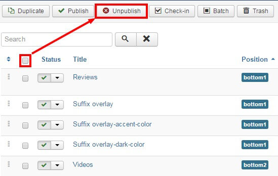
To deactivate all modules at once, click on the tickbox at the top of the second column in the module list to select every module, then click on the Unpublish button at the top of the screen to deactivate. Once done, do the same for any other pages should there be more modules. The existing modules are now deactivated and you can start with the template install.
Download and Install the Template
Now that you're ready to install, the first thing to do is download and install the template's zip package. Click on the following link to go to the Box Download Page (you must be logged-in to do so!). You'll see that there are three different files available:
- gk_box_J!3.zip - This package contains the basic template files; you should download this package for manual installation.
- gk_box_quickstart_J!3.zip - This contains the quickstart files for a new installation of Joomla that matches the demo layout exactly; this can be ignored if you are installing manually.
- gk_box_rest_files_J!3.zip - This package contains the source PSD files for the template as well as additional plugins required to expand the template functionality. Make sure to download this package too if you are installing manually.
Grab the basic template package and the rest files package; both will be needed during this install. You might also want to download the quickstart package if you want to use the demo images as placeholders before you add your own content; we'll discuss how to do this later. Once downloaded, we can install the template package:
- Login to your Joomla! backend and click on Extensions → Extension Manager, the manager's screen will open; now click on the Upload Package File tab at the top of the screen.

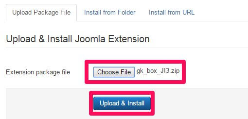
- Click on Choose File to open your file browser; select the recently-downloaded gk_box_J!3.zip file, then click the Upload & Install button.
- Once installation is complete, click on Extensions → Template Manager to open the list of available templates; you should now see gk_box in the list.
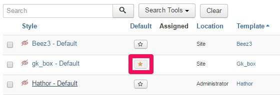
- Click on the star next to gk_box in the Default column to set it as the default template.
The template is now installed and ready to go; next we need to take care of the plugins and modules.
Installing Extras (Plugins & Modules)
The Box template's frontpage and other features are provided via a combination of custom HTML for the simpler content, and our own open-source modules for more complex features such as frontpage product displays, tabs and slideshows, so you'll need to install these additional free modules to ensure you are able to match the demo layout. Also, the Gavern Framework that underpins all our templates utilizes several unique plugins that provide additional features such as social media sharing functionality, which will also need to be installed. Finally, there are two free third-party extensions supported by Box which we recommend you install to access the full capabilities of the template; Virtuemart, which provides the ecommerce functions, and K2, which is a powerful alternative to the standard Joomla! Article Manager.
Installing the Plugins
The plugins in Box are core elements of our Gavern Framework that powers our Joomla templates. This framework is designed to be modular, with plugins providing additional functions that can be optionally removed if no longer needed, including support for advanced typography, social media functionality and more. These elements are all included in the gk_box_rest_files package that you downloaded earlier. To install the plugins, extract the gk_box_rest_files package on your local computer. You will see that it contains three folders; Modules, Plugins and Source. Log-in to your Joomla! backend and navigate to Extensions → Extension Manager → Upload Package File as you did with the template install.
Now click on the Choose File button to open the file explorer, and navigate to your extracted gk_box_rest_files → plugins folder; you will see a set of zip packages that each contain a plugin. These are all the plugins that are recommended for the template; double-click on the first plugin in the folder to select it, then click the Upload & Install button. The install process will run. Once finished, repeat this install process for all the plugins in the folder in whichever order you prefer. Once all the plugins are installed you will need to activate them; navigate to Extensions → Plugin Manager in the top menu to see a list of installed plugins.
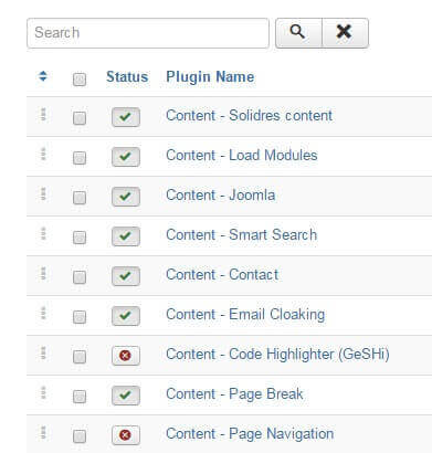
Find the plugins you have just installed; they will have a red X next to them to show they are not activated. Activate them by either clicking the X, or bulk-activate by adding a check to the tickbox next to each plugin to activate, then click the Enable button at the top of the page.
Installing the Modules
There are three Gavick-designed modules that are essential for matching the frontpage demo layout; News Show Pro GK5, Image Show GK4 and Tabs GK5, which together create the frontpage product previews and tabbed slides seen on the demo frontpage. To download these modules navigate to our Joomla! modules' download section ; you'll see a list of the various open-source modules GavickPro has created; there's quite a few! To start with we'll get the News Show Pro module, so click on the News Show Pro GK5 link to be taken to the download page for the module, and get the Joomla 3 version of NSP, called mod_news_pro_gk5_J!3.zip.
Now do the same for Tabs GK5; again there'll be three files available, two of which are for Joomla! 2.5, so download the Joomla 3-specific version; mod_tabs_gk5_J!3.zip; next, repeat this process for Image Show GK4; there are only two files available for this module so download the mod_image_show_gk4_J!3.zip package, which contains the Joomla! 3.5-specific version of the module. With all three of the modules we need downloaded we can start installing; this is functionally the same install process as with the plugins, but without the need to extract first. Login to your Joomla! backend and open the Extension Manager and click on the Upload Package File tab. Click Choose file and find your downloaded News Show Pro package and double-click it, then click the Upload & Install button to begin installation. Repeat this install process for the Tabs and Image Show zip packages too.
Once the modules are installed we can install the third-party extensions that are used in the template; one of them, Virtuemart, is essential if you wish to access the product displays and sale functions of the template, whereas the other, K2, is non-essential but highly recommended.
Installing Virtuemart
Virtuemart is a mature, complete ecommerce solution for Joomla!, offering the full range of product management, pricing, sales and payment options that a modern shopping website needs to give a comfortable purchasing experience to their customers. To install it, visit the VirtueMart Download Page and click on the Download VM3 Now button; this will download a file called com_virtuemart.3.x.x_extract_first.zip. This package contains the core installation files required for an existing Joomla! site, so you can ignore the other downloads.
Once the file is downloaded, extract it locally as the individual components will need to be installed one by one. Once extracted you will be left with three separate zip files. Now log-in to your Joomla! administrator area and click on Extensions → Extension Manager in the top menu to open the Extension Manager: Install page. Click on the Upload Package File tab and then click the Choose File button to open the file explorer. Select the file you wish to install, then click on the Upload & Install button to install the package. The three files should be installed in the following order:
- com_virtuemart.3.x.x.zip - This is the core VirtueMart extension, and should be installed first.
- com_virtuemart.3.x.x_ext_aio.zip - This package contains the VirtueMart-specific modules and other components, and should be installed second.
- com_tcpdf_1.x.x.zip - This package contains the component needed to create PDF invoices that can be emailed or printed for your customers, and should be installed last. If you are an advanced user who does not require PDF invoices or if you have alternative invoicing methods ready then you can ignore this package, but all other users or those who are not sure of their requirements should install it as standard.
Once all of the packages have been installed in order VirtueMart will be ready to use, but there is one very important change that needs to be made in the VirtueMart configuration. Click on VirtueMart → Configuration in the Joomla! main menu to open the configuration screen for VirtueMart. There are a lot of options here, but we only need to change one for now; click on the Templates tab and, in the Activate CSS Styles & Javascripts section, disable the Using the VirtueMart CSS option and save changes. If you do not do this, then the template CSS will be overidden and will not match the demo. When this option is changed, we can move on to installing K2.
Installing K2
K2 offers complex article management options that far surpass those included in the core Joomla article manager, so it's a useful alternative if producing unique written content is a core part of your online product. To install this component, open the K2 site and click on the green Download K2 button in the header area to be taken to the download screen to start the download. Once done, login to your Joomla backend and open the Extension Manager via the top menu, then click on the Upload Package File tab. Now click Choose File and select your recently downloaded K2 package and then click Upload & Install. After a few moments K2 will be installed and you'll be ready to go!
Importing Template Settings
The template settings cover a wide range of options, including layouts, fonts, and other special features that allow users to add their own touch to their website. By importing settings, you can achieve the recommended style based on our demo example without manually configuring each setting.
To import these settings, we first need to get the json file that stores them; this may be found at this download link .
If you just click on the link you'll probably run into a little issue; instead of downloading the file your browser will instead try to open and display the file contents in the viewport. It won't break anything, but you don't want to waste time copying and pasting the data into a new file, right? So to get around this, we'll need to tell the browser that we want to download, rather than display the file. The process is essentially the same for every browser, but for some reason each of them decide to name the command you need to use differently:
- In Safari - Right or control-click on the link and select ‘Download linked file’. This will download a file called Box_config.json.
- In Chrome - Right-click on the link and select ‘Download link as…’. A dialogue box will open to specify where the download should be saved. The name will default to Box_config.json, so just leave this as default and save the file.
- In Firefox - Right-click on the link and select ‘Save link as…’. A dialogue box will open where you can specify the save location; as with the other browsers the name will default to Box_config.json so leave this as it is.
- In Internet Explorer - Right-click on the link and choose 'Save Target as'. A dialogue box will open so you can decide where to download the file to. The file name will default to Box_config.json, so leave this as it is.
Once downloaded, you need to import the settings into your Joomla installation. Connect to your server via FTP and navigate to the templates → gk_box → config folder; here is where the json configuration files are stored. Upload your recently-downloaded Box_config.json to this folder so that it can be found by Joomla. Now you can close your FTP program and login to your Joomla! backend as normal.
Click on Extensions → Template Manager to open the list of installed templates, and find the gk_box template in the list; click on it to open the template options panel. At the top of the screen is a set of tabs for each section of the settings. Open the Basic Settings tab; you'll notice that there is a Load configuration setting as the top option. At this point you'll only have the default.json configuration loaded, but if you click on the drop-down list under Load configuration you'll see the Box_config.json file you uploaded before select this from the list and then click on Load to apply the settings from the file.
Assigning the Frontpage ID
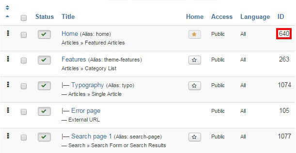
By default they certain page IDs will be assigned as the frontpage and additional pages; this controls which CSS rules are applied. However, depending on your configuration it is likely that your frontpage will have a different ID to that which is automatically stored in the imported settings. As such, we will also need to specify the frontpage ID. To do so, click on Menus → Main Menu in the top menu of your Joomla backend to see a list of assigned menu items. Make a note of the ID for your Home menu item; this number is located in the last column of attributes as in the screenshot below:
Click on Extensions → Template Manager → gk_box → Features tab to see the list of special features options included in the Box template. We're interested in the Suffixes for pages option at the bottom. In the ItemID/Option field, enter the ID number for your Home menu item, then in the Suffix field, type frontpage, then click the Add Rule button.
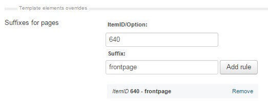
The frontpage suffix will be added to your Homepage, and the correct CSS rules will be applied. Now repeat this process twice to add two more CSS suffixes to the frontpage; nav-transparent and frontpage-grid.
As the Box template's frontpage also uses the sidebar to place several modules in, we must also make a change in the frontpage's sidebar width. To do this, click on the Layouts tab; the second to last option in this section is Custom Sidebar Width. In the ItemID/Option field, enter your frontpage ID. Next, in the Width field, set this to 50% and click the Add Rule button. The sidebar is now set to the correct width.
Now we can start creating the content for the site; at this point you may choose to upload the placeholder demo images if you do not have any of your own ready on your site, or jump straight to installing the modules for the frontpage.
Upload the Demo Images (Optional)
The modules that we will setup in this tutorial will include references to images that are part of the demo content in the quickstart package, but are not included in the base template package that is used for manual install. This means that any image references will not be accurate, and the frontpage and other areas may not display properly until you assign your own images to each section, which you can do as we create each module.
However, if you haven't prepared your own frontpage images yet then you might want to consider uploading the demo images; this way you can just follow the basic module setup and any images referenced in the modules will be available, so you can see the layout on your site and replace the images with your own later. Uploading the demo images is very easy; we can simply take the folder from the quickstart package and upload it to our site via FTP.
The module placement guide assumes that you have uploaded the demo images to your server in certain situations, such as when images are defined in the HTML code; if you have your own images, simply replace the src attribute accordingly as you reach each section of the guide.
To upload the folder, firs you'll need to get the quickstart package from the Box download page ; click on the gk_box_quickstart_J!3.zip package. Once the download finishes, then extract the package on your local machine.
When the extraction is complete open the extracted quickstart folder; inside you'll find an Images folder, and inside that will be a Demo folder; this contains the demo-specific images for Box. Connect to your server using the FTP program of your choice and upload the Demo folder to the Images folder of your Joomla installation (this is in the root of your Joomla install).
With this folder uploaded the references included in the custom HTML of the frontpage modules (such as the advertisement banners) will point to the demo images as placeholders until you're ready to add your own content.
Module Placement
The frontpage of the Box template is based on modules; from simple custom HTML modules to more complex modules such as our News Show Pro showcase module, that can be used to display articles or VirtueMart products in portal modes specially-designed for Box. If you're going to build a site that looks every bit as good as the demo layout then it's very important that the modules are assigned and configured correctly to ensure that your site gives the perfect first impression. In each module you will find some standard options that appear in every module regardless of type, and module-specific options that control the finer details.
The basic steps for placing a module are:
- Login to your Joomla! backend and click on Extensions → Module Manager in the top menu to open the Module Manager, where you can see a list of modules currently assigned to your site (as per our preparation any existing modules in your installation should be disabled, indicated by a red X under the Status column, or deleted if unnecessary to avoid confusion).
- Click on New at the top of the screen to open a list of available Module Types.
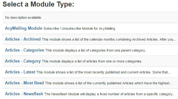
- Select the required Module Type from the list; you will be taken to the settings screen for the module.
- In the Module tab (the first options tab you see when creating a new module of any type), add a title to the Title field; this is required before the module can be saved.
- Set the Show Title option to Show or Hide, depending on the required module settings; some modules use the title text, while others will not.
- In the Position field, set the module position. This tells Joomla where the module should be displayed on your site. You may either select the required position from the drop-down list, or manually type the (case-sensitive) module position into the position field.
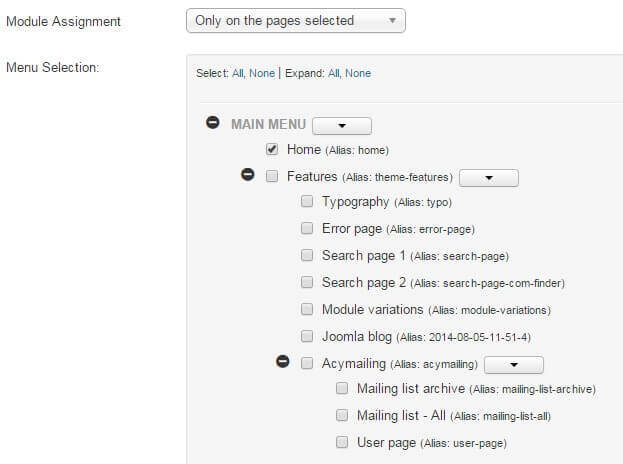
- Open the Menu Assignment tab. Here, there is a Module Assignment drop-down list where you can define on what pages/menu items a module should appear on. In Box there are two settings used here; either the module is left at the default On All Pages, so it will appear everywhere on your site (such as with the bottom menu) or the option is set to Only on the pages selected. When this option is set, a list of available pages/menu items will appear, and you can add a checkmark next to the relevant item. Usually, this option is used to display a module on the frontpage only.
- Configure the module-specific settings. Each module will have its unique settings, some more than others. For example, our robust News Show Pro module has multiple tabs of options, whereas a Custom HTML module will just have a space for adding HTML content.
- Save changes to place the module.
These basic steps will be the same for every module placement; it's a good idea to familiarize yourself with this process if you are new to Joomla!, as it is one of the best ways to make your site your own.
Now let's configure the modules for our frontpage.
Frontpage Modules
The frontpage modules provide the core functionality that your frontpage offers, with product showcases, tabbed slides and carefully crafted image and text blocks that will help you build you company brand and maximize sales, so it's important that they are configured correctly. We will cover each module position of the frontpage in turn until the frontpage layout is complete.
Before starting module placement it is advisable that you disable the TinyMCE or other WYSIWYG editors. This is because these editors automatically cleans up empty HTML tags, but sometimes the modules used in our templates include custom HTML modules that use blank tags to create icons or for additional CSS purposes, so these empty tags shouldn't be removed. Since the clean-up cannot be disabled it is instead necessary to disable the editors.
In order to disable the WYSIWYG editor:
- Click on Users → User Manager in the top menu of your Joomla backend to be taken to a list of your registered users.
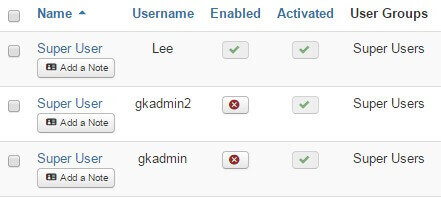
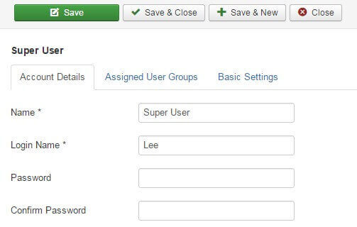
- Click on the username you will be logged in as when placing the modules to be taken to the Edit Profile screen.
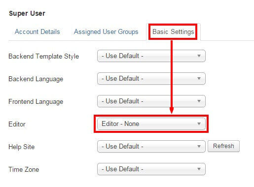
- Click on the Basic Settings tab and change the Editor option from Use Default to Editor - None.
- Click on Save & Close at the top of the screen to save changes.
Now when you open the editor in an article or Custom HTML module you will see just the plain text editor, and empty tags will not be automatically removed. Once you have finished module placement you may wish to reactivate the editor for the user should you intend to use it to write articles.
Though each type of module will offer a range of differing options, there are two basic but important options tabs to be found in every module; Module and Menu Assignment, which offer four core options; title, show/hide title, position, and menu assignment. The basic options for each frontpage module will be provided at the beginning of each module's relevant section, with the more complex module-specific settings following.
Each module covered in this section will include the following information:
- Module Desciption - A short description of the the module and how it is used on the frontpage, along with a link to a screenshot of the complete module settings should you prefer to match the configuration by sight rather than by following the guide. Note that in the case of custom HTML modules the HTML code that needs to be added to the module will be included in the Main Configuration section described below.
- Basic Settings - Provides the basic configuration details, including the module type that should be selected from the list of available modules when creating a new module, and the title, show/hide title, position and menu assignment settings as used in the demo.
- Main Configuration - Covers the module-specific settings, such as configuring the News Show Pro layouts, or providing the code to be added to a Custom HTML module.
With these sections you will be able to accurately match the demo layout. Now on to the modules!
The Frontpage Header
The frontpage header is a simple introduction to your website, consisting of a large header image with overlaid text. :
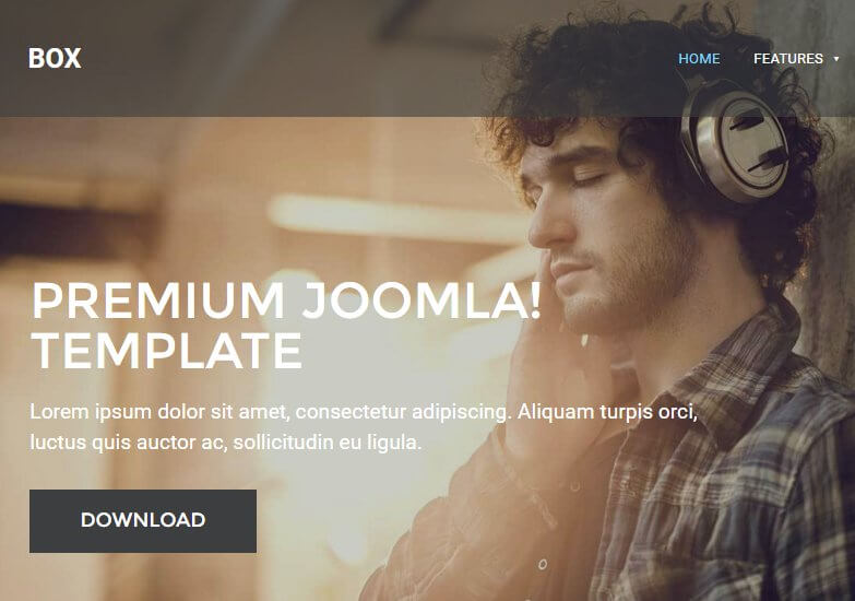
If needed, click on the following link for this module's Configuration Screenshot .
Basic Settings
- Module Type: Custom HTML
- Module Title: Header
- Show/Hide Title: Show
- Module Position: header
- Module Assignment: Only on the pages selected.
- Selected Pages: Homepage only.
Main Configuration
Since this section is created using custom HTML it is extremely easy to set up. Simple copy the following HTML code and paste it into the editor of your module; you may change the header image in the <img> tag and add your own text to the <h1> and <p> tags, but make sure to leave the core <div> structure as this is required for correct styling of the text:
                         <div class="gkHeaderBlock"><img src="/images/demo/header_bg.jpg" alt="" />
                         <div class="gkHeaderContent">
                         <h1>Premium Joomla! Template</h1>
                         <p>Lorem ipsum dolor sit amet, consectetur adipiscing. Aliquam turpis orci, luctus quis auctor ac, sollicitudin eu ligula.</p>
                         <a class="btn inverse" href="#">Download</a></div>
                         </div>
No other options need to be changed, so save the module and we can move on to the other sections.
The Text Block Sidebar
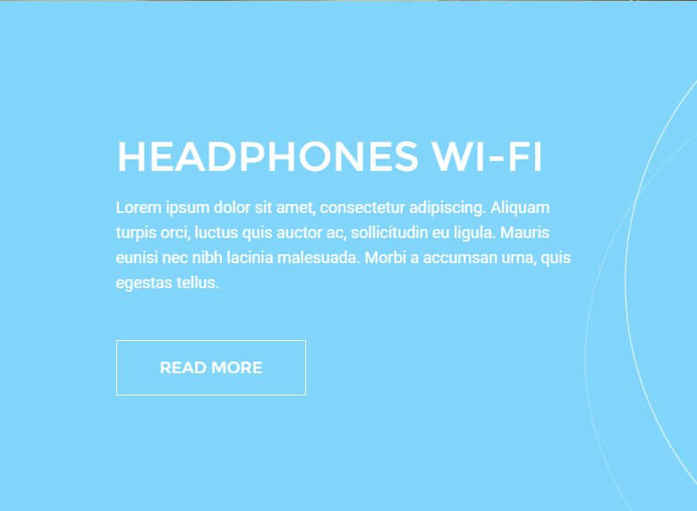
This section provides the bright background block with text and button link directly under the header:
If needed, click on the following link for this module's Configuration Screenshot .
As the frontpage of Box is split into a grid-style layout, the first text block underneath the header is actually placed in the sidebar, though when placed it will appear in the left 50% of the site.
Basic Settings
- Module Type: Custom HTML
- Module Title: Headphones Wi-Fi - sidebar
- Show/Hide Title: Hide
- Module Position: sidebar
- Module Assignment: Only on the pages selected.
- Selected Pages: Homepage only.
Main Configuration
Again, this section is created using simple custom HTML, so configuration is very easy. Copy the following HTML code into the editor of your module; you may add your own text as needed, and don't forget to change the <href^> attribute in the link tag to configure where the user will be directed when clicking on the button, as this is not set to anything by default:
                         <h2>Headphones Wi-Fi</h2>
                         <p>Lorem ipsum dolor sit amet, consectetur adipiscing. Aliquam turpis orci, luctus quis auctor ac, sollicitudin eu ligula. Mauris eunisi nec nibh lacinia malesuada. Morbi a accumsan urna, quis egestas tellus.</p>
                         <p><a class="btn border" href="#">Read more</a></p>
Next open the Advanced tab and, in the Module Class Suffix field, add the following:
animated-color-bg
This will add the required styling to the section. This section is now configured so you can save and close the module.
The Frontpage Banner
This section displays a plain image aligned to fit with the text block above it in the sidebar area of the frontpage:

If needed, click on the following link for this module's Configuration Screenshot .
Basic Settings
- Module Type: Custom HTML
- Module Title: Frontpage banner
- Show/Hide Title: Hide
- Module Position: sidebar
- Module Assignment: Only on the pages selected.
- Selected Pages: Homepage only.
Main Configuration
Since this section only displays an image, you only need to add the following HTML code to the editor of your custom HTML module:
<p><img src="/images/demo/frontpage_img.jpg" alt="" /></p>
Now click on the Advanced tab and add the following text to the Module Class Suffix field:
clear
With that done the module is configured, so you can save the changes.
The Frontpage Slideshow
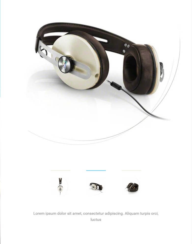
The Frontpage Slideshow displays a series of images controlled by a tabbed pagination bar, allowing users to rotate through the available slides:
If needed, click on the following link for this module's Configuration Screenshot .
Basic Settings
- Module Type: Image Show module.
- Module Title: Image Show GK4
- Show/Hide Title: Hide
- Module Position: mainbody
- Module Assignment: Only on the pages selected.
- Selected Pages: Homepage only.
Main Configuration
Image Show is more complex than the custom HTML modules we've used so far, so there are several additional options that will need to be configured as well as the slides added to recreate the demo example. First, open the Basic option tab, then add the following text to the Module ID field:
gk-is-1
Next, click on the Module Style drop-down list and select gk_box style, which is the new portal mode created especially for this template. The next tab is Your Slides, where you can add your own slides to the module. Click on the Add New Slide button to open the slide options. In the Image field, click the Select button and choose a slide from your media; if you've uploaded the demo images then you'll find an image called slide-1 ready to use as a placeholder. The image you choose will be used both as the slide image and also as the thumbnail tab that appears at the bottom of the section.
Next comes the text content, which appears underneath the tab area at the bottom of the module. The text you wish to display here should be added to the Content field. You may add your own content in these fields as you see fit; the demo layout uses a basic Lorem Ipsum as placeholder text:
Lorem ipsum dolor sit amet, consectetur adipiscing. Aliquam turpis orci, luctus
You should also add a title into the Title field; this won't be displayed on the frontpage but it will help you to track your slides should you need to make changes. You can also add a link address to the URL field, which specifies where the slide should link to when clicked. Once done, click on Save button to save the slide. Repeat this process again to add additional slides as needed; in the demo content we have three slides, each using a Lorem Ipsum for the placeholder text and the demo slide-2 and slide-3 images, respectively.
No other options need to be changed here, so once you've finished adding your slides click the Save & Close button to save changes.
The New Models Section
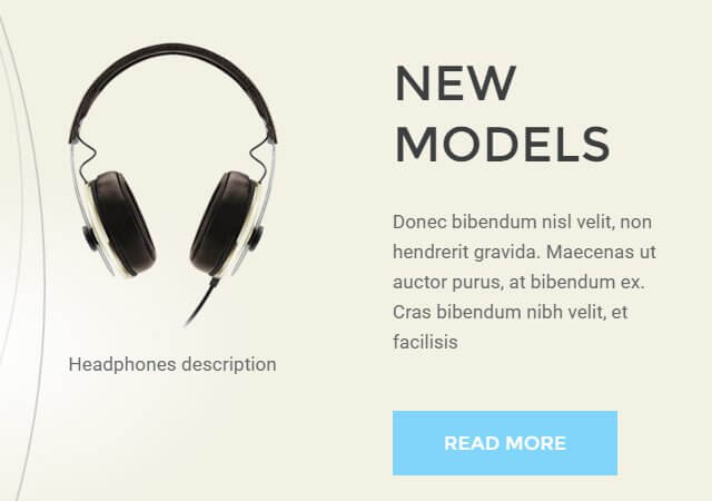
This section displays a set of images with a text block and button on the right-hand side:
If needed, click on the following link for this module's Configuration Screenshot .
Basic Settings
- Module Type: Custom HTML
- Module Title: New models
- Show/Hide Title: Hide
- Module Position: bottom1
- Module Assignment: Only on the pages selected.
- Selected Pages: Homepage only.
Main Configuration
Another custom HTML module, so as you'd expect it's easy to replicate. First, add the following HTML code to your editor in the module:
                         <div class="showcase"><header class="showcase-header">
                         <h2>New models</h2>
                         <p>Donec bibendum nisl velit, non hendrerit gravida. Maecenas ut auctor purus, at bibendum ex. Cras bibendum nibh velit, et facilisis</p>
                         <a class="btn">Read more</a></header>
                         <div class="showcase-pictures">
                         <div class="showcase-item"><img src="/images/demo/new-models-1.png" alt="" />Headphones description</div>
                         <div class="showcase-item"><img src="/images/demo/new-models-2.png" alt="" />Headphones description</div>
                         </div>
                         </div>
The content of the text block can be modified in the first part of the HTML code above, with the <h2> tags containing the headline text, the <p> tags containing the text underneath the headline, and the <a> link tag defining the button link target and setting the text of the button. For the images, you'll need to amend the <img> tags that appears in lines 7 and 8 of the above code; the src attribute defines the image, and the text before the closing </div> tag defines the description text underneath the image, if required. Once your content is prepared, save the module.
The Headphones Wi-Fi Section
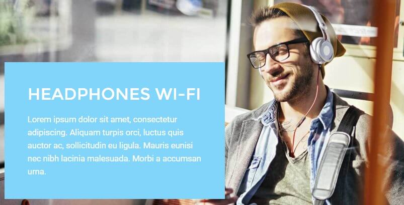
This section displays an image with a text block overlaid:
If needed, click on the following link for this module's Configuration Screenshot .
Basic Settings
- Module Type: Custom HTML
- Module Title: Headphones Wi-Fi
- Show/Hide Title: Hide
- Module Position: bottom2
- Module Assignment: Only on the pages selected.
- Selected Pages: Homepage only.
Main Configuration
As this is another custom HTML module, you will need to copy the following HTML into the editor screen of the module:
                         <div class="gkPhotoOverlay"><img src="/images/demo/bottom2-bg.jpg" alt="" />
                         <div class="gkPhotoOverlayContent">
                         <h2>Headphones Wi-Fi</h2>
                         <p>Lorem ipsum dolor sit amet, consectetur adipiscing. Aliquam turpis orci, luctus quis auctor ac, sollicitudin eu ligula. Mauris eunisi nec nibh lacinia malesuada. Morbi a accumsan urna.</p>
                         </div>
                         </div>
Remember that you may add your own text or image content to this section as you see fit. Once done, open the Advanced tab and enter the following text into the Module Class Suffix field:
overlay
The module is now ready, so you can save changes.
The Visit Our Store Section
This area utilizes our News Show Pro module to display a range of product previews pulled from Virtuemart:
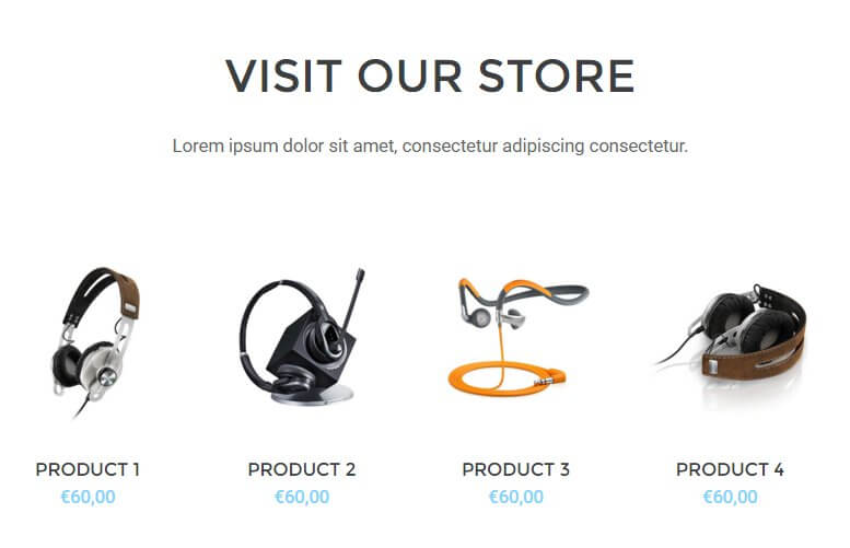
If needed, click on the following link for this module's Configuration Screenshot .
Basic Settings
- Module Type: News Show Pro GK5
- Module Title: Visit our store __Lorem ipsum dolor sit amet, consectetur adipiscing consectetur.__
- Show/Hide Title: Show
- Module Position: bottom3
- Module Assignment: Only on the pages selected.
- Selected Pages: Homepage only.
Main Configuration
This section takes full advantage of the complex options available in News Show Pro, so as before we will move through each option tab step-by-step covering which options should be changed from the default.
Basic Settings Tab
No changes required from default.
Data Source
This section allows you to define which products should be displayed on your frontpage; the Source of Articles option can be set to VirtueMart Products or VirtueMart Categories, and you can change the order using the News order and News sort order options to set whether products should be listed by newest first (either from all products or from specific categories as defined in the Source of Articles option), alphabetically, randomly and more. You can also specify exact products to be displayed if you'd prefer to have fine control over your frontpage showcases. In the demo layout, VirtueMart Categories are set as the data source, and one category, Headpiece, is used from the demo products as an example. Set the options here to your own products and preferences.
VirtueMart Additional Settings
This section is specific to VirtueMart data sources, and requires two changes from the default settings. First, change the Show Add to Cart Button option to On, and change the Display Type drop-down option to Price Only.
Article Layout
There's a number of options under different subheadings in this section, but we only need to change a few of them. Let's look at each section of this tab's changes:
Under the Article Pagination section:
- Amount of pages with arts - Change to 1.
- Amount of columns - Change to 4.
- Amount of rows - Change to 1.
Under the Header section:
- Header Position - Change to "text-align:center".
Under the Image section:
- Image Position - Change to "text-align:center".
- Image Floating - Change to "float:none".
- Image Link - Change to "Off".
Under the Text section:
- No changes required.
Under the Information Block section:
- Information Position - Change to "text-align:center".
-
Info format - Change to the following text:
%STORE
Under the Article Layout section:
- Article block padding - Change to 20px 40px 20px 0.
- Header order - Change to 2.
- Image order - Change to 1.
- Text order - Change to 4.
- Text Enabled - Change to Disabled.
- Information order - Change to 3.
- Info Enabled - Change to Off.
- Second info enabled - Change to Disabled.
- Read more enabled - Change to Disabled.
The Article Layout section is finished, so we can move on to the Links Layout tab.
Links Layout
Change the Amount of pages with links option to 0.
Thumbnails
Change the Wrap content and Create thumbnails options to On.
Set the Thumbnail dimensions option to 140px by 156px.
The section is now configured, so you can save the changes.
The Bottom Menu
This section appears at the bottom of every page on the site, and displays menu and social links along with a newsletter sign-up field:
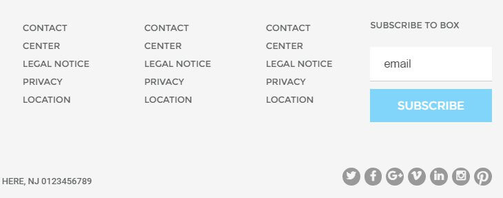
If needed, click on the following link for this module's Configuration Screenshot .
Basic Settings
- Module Type: Custom HTML
- Module Title: Bottom
- Show/Hide Title: Hide
- Module Position: bottom4
- Module Assignment: On All Pages.
Main Configuration
We're back to the custom HTML modules, so copy the following code into the editor of your module; you may modify each link's URL and text as needed, and basic information for configuring the newsletter form is in the comments of the code:
                         <div class="gk-cols gk-bottom-links">
                         <ul class="col-width-20">
                         <li><a href="#">Contact</a></li>
                         <li><a href="#">Center </a></li>
                         <li><a href="#">Legal Notice</a></li>
                         <li><a href="#">Privacy </a></li>
                         <li><a href="#">Location</a></li>
                         </ul>
                         <ul class="col-width-20">
                         <li><a href="#">Contact </a></li>
                         <li><a href="#">Center </a></li>
                         <li><a href="#">Legal Notice</a></li>
                         <li><a href="#">Privacy </a></li>
                         <li><a href="#">Location</a></li>
                         </ul>
                         <ul class="col-width-20">
                         <li><a href="#">Contact </a></li>
                         <li><a href="#">Center </a></li>
                         <li><a href="#">Legal Notice</a></li>
                         <li><a href="#">Privacy </a></li>
                         <li><a href="#">Location</a></li>
                         </ul>
                         <ul class="col-width-20">
                         <li><a href="#">Contact </a></li>
                         <li><a href="#">Center </a></li>
                         <li><a href="#">Legal Notice</a></li>
                         <li><a href="#">Privacy </a></li>
                         <li><a href="#">Location</a></li>
                         </ul>
                         <!-- Begin MailChimp Signup Form --> <!-- put your url from MailChimp form into action="your link here" --><form class="col-width-20 gk-newsletter" action="#!" method="post" name="mc-embedded-subscribe-form" novalidate="" target="_blank">
                         <h3>Subscribe to BOX</h3>
                         <input id="mce-EMAIL" class="required email" name="EMAIL" type="email" value="" placeholder="email" /> <!-- real people should not fill this in and expect good things - do not remove this or risk form bot signups-->
                         <div style="position: absolute; left: -5000px;"><input tabindex="-1" name="b_6601f0307e28eefdfd842bbdd_2007e79bce" type="text" value="" /></div>
                         <div class="clear"><input id="mc-embedded-subscribe" class="button" name="subscribe" type="submit" value="Subscribe" /></div>
                         </form><!--End mc_embed_signup--></div>
                         <div class="gk-cols">
                         <div class="col-width-75 gk-contact-info">Your Postal Address here, NJ 0123456789<br /> +1 12 345 1234 5678</div>
                         <div class="col-width-25 gk-social-icons"> </div>
                         </div>
Now open the Advanced options tab and add the following suffixes to the Module Class Suffix field:
gray-bg animated-circles big-spaces
Once done, save the changes to the module.
The Shopping Cart
Shoppers won't get very far if there's no way to purchase anything; that's why it's essential to have the VirtueMart Shopping Cart module in place. In Box, only the default cart module is used, so configuration is virtually instant, but you will need to ensure it is assigned to the correct module position.
Basic Settings
- Module Type: VirtueMart Shopping Cart
- Module Title: VM - Shopping cart
- Show/Hide Title: Show
- Module Position: cart
- Module Assignment: On All Pages.
Main Configuration
Nothing more needs to be done for this module; the default settings are all you need, so you can save. Do remember that the install process of VirtueMart creates an instance of the shopping cart module by default, so if you've just installed the extension you can simply modify the existing instance of the cart to assign it to the cart module position instead of the default position-4.
The Search Bar
Adds a search bar to the top of all pages. This uses a standard search module with default options.
Basic Settings
- Module Type: Search
- Module Title: Search
- Show/Hide Title: Show
- Module Position: search
- Module Assignment: On All Pages.
Main Configuration
No changes are required from the default settings.
Menus
There are several menu positions available in Box, and here we will create some placeholder menus to complete the look of the frontpage and give you somewhere to work from as you add your own items.
User Menu
A user menu is included in Box to let users manage their profiles and other information. It isn't necessary to allow logins for your site, but if you're going to use the ecommerce features of Box then allowing logins will let users track and manage order history as well as give you insight into particular purchase habits which will help you plan your sales strategy. To create this menu:
In your Joomla backend, click on Menus → Menu Manager → Add New Menu to be taken to the Menu Details screen. Enter a title and menu type in the respective fields; in the demo content we use User Menu as the title, and mainemu as the Menu Type. Then click on Save & Close to save the changes. You will be taken back to Menu list where you'll need to add some items.
Click on Menus → User menu → Add New Menu Item to go to the Edit Menu Item screen; in the Title field, type Your Profile. Click on the Select button in the Menu Item Type field and select Users Manager → User Profile. Change the Access option on the right-hand side to Registered, then click Save & Close to save changes.
Repeat this process of adding a new menu item, but this time name the menu item Edit Profile, and in the Menu Item Type field select Users Manager → Edit User Profile. Add yet another new menu item, then type Create Article in the title field and select the Articles → Create Article menu item type before saving.
One more time; go through the steps to create a new item; type Create Article in the title field and select the Article → Create an Article menu item type before saving. Make sure that each of these menu items are limited to access from registered users only to prevent issues. The User menu is now ready, and we can assign it to its position.
Assigning the Menu
This is very simple; just open your Module Manager, click on the green New button, and in the list of available modules click on the Menu option. Add a title to the title field; in the demo we use User area. Select the usermenu position in the Position field's drop-down list, or write the position into the field manually. Now, in the Select Menu field, select your new User Menu. Leave all other options as default and click on the Save & Close button to save changes. Your menu is now set-up.
Top Menu
The top menu appears at the very top of every page, providing quick links to help pages and the shopping cart. To create this menu, click on Menus → Menu Manager → Add New Menu as before and enter a title and menu type; we use Top menu as the title and top-menu as the menu type. Now click on Save & Close to save the menu.
Click on Menus → Top Menu → Add New Menu Item in your Joomla! admin menu to go to the Edit Menu Item screen. Add Help as the title and select System Links → External URL as the Menu Item Type; you may add your help page link here, or just save the menu item if you will do this later. Repeat the process to add a second menu item, and set the title as Cart. This time for the Menu Item Type, click on the Select button and then choose VirtueMart → Shopping Cart, and save changes. Now you can assign the menu by opening your Module Manager and creating a new module. Set the title to Top menu and, in the Select Menu drop-down list, choose your new Top menu. Finally, set the module position to top_nav and save changes.
Footer Menu
As well as the main menu area, there is also a footer menu area prepared in the demo layout. This is used just as a placeholder ready for your links to be added, but you may wish to create it before beginning customization just so you can see the full frontpage layout.
Click on Menus → Menu Manager → Add New Menu to go to the Menu Details screen. Enter a title and menu type in the respective fields; in the demo content we use Footer Menu as the title, and footermenu as the Menu Type. Then click on Save & Close to save the changes. You will be taken back to Menu list where you'll need to add some items.
Click on Menus → User menu → Add New Menu Item to go to the Edit Menu Item screen; in the Title field, type Privacy Policy. Click on the Select button in the Menu Item Type field and select System Links → External URL, then click Save & Close to save changes. Repeat this process to add another external link, Cookies. The URLs can of course be modified to point to your own cookie/privacy policy as needed, or you can replace/add menu items as you see fit. Once done, open your Module Manager, click on the green New button, and in the list of available modules click on the Menu option. Add a title to the title field; in the demo we use Footer menu. Select the footer_nav position in the Position field's drop-down list, or write the position into the field manually. Now, in the Select Menu field, select your new Footer Menu. Leave all other options as default and click on the Save & Close button to save changes, and the placeholder footer menu is ready!
Additional VirtueMart Settings
We already covered the most important option earlier in this guide, but if you wish to match the VirtueMart store layout as seen in the demo exactly, then there are some additional settings you'll need to modify. In the Joomla! backend, click on VirtueMart → Configuration to open the settings panel, then click on the Shopfront tab. The following changes need to be made:
- Show the Print View link - Uncheck this option.
- Use ReCaptcha for recommendation and 'Ask a question' - Uncheck this option.
- Latest Products - Number of days to display - Set to 4.
- Auto-publish reviews - Uncheck this option.
- Show Review - Change to Don't Show.
- Enable Review System - Change to Disabled.
- Show Rating - Change to Don't Show.
- Enable Rating System - Change to Disabled.
Next, click on the Templates tab; we'll need to change a few settings here in addition to the CSS option from earlier, starting with the Shopfront settings section:
- Default number of categories in a row - Change to 4.
- Default number of products in a row - Change to 4.
- Default number of manufacturers in a row - Change to 4.
In the VirtueMart Home Page Settings section:
- Default number of categories in a row - Change to 4.
- Default number of products in a row - Change to 4.
In the Home Page Feed Settings section, disable the Enable Latest Product Feeds, Enable Top Ten Product Feeds and Enabled Featured Product Feeds options.
In the Media Files Settings section, change the Thumbnail Image Height to 340.
The settings are now configured, so save changes and you're ready to go.
Adding Features Lists to Product Pages
The demo layout for VirtueMart products includes fine product details, such as the microphone impedance. These are added via Editor custom field, with the following HTML layout:
                         <dl>
                              <dt>Feature Title:</dt>
                              <dd> Feature Value </dd>
                              <dt>Feature Title:</dt>
                              <dd> Feature Value</dd>
                         </dl>
Using this format you may add as many features as you want; to separate two sets of features, simply create a new Editor custom field and add a new description list to it; each list will be populated at the bottom of the product page after the description.
Box Advanced Typography
Box includes some useful typography features that will make your site more readable and visually interesting; in this section we'll cover what they are, and how to use them.
Using Advanced Typography
Inserting the advanced typography available in Box into your articles is possible via the Text mode of the TinyMCE editor, where you can enter raw HTML and add the necessary classes to the HTML tags. To switch to the Text version of the editor, click on the Toggle Editor button in the bottom-right of the editor window. To add a particular typography style to a supported HTML tag, you'll need to add the class attribute with the class of the styling you wish to use attached; for example, if we wanted to use the Information Alert box around our text, then we'll add a standard <p> tag and attach the alert-info class:
<p class="alert info">Text goes here</p>
In the following sections we'll cover the available styles and their required classes, so you'll be ready to go.
Warnings
Warnings are highlighted text segments that are meant to draw attention to important information, such as rules, advice or guidelines. There are four types of warning available, each with a different purpose. To use them, simply add the class name to a <p> element:
<p class="classname">
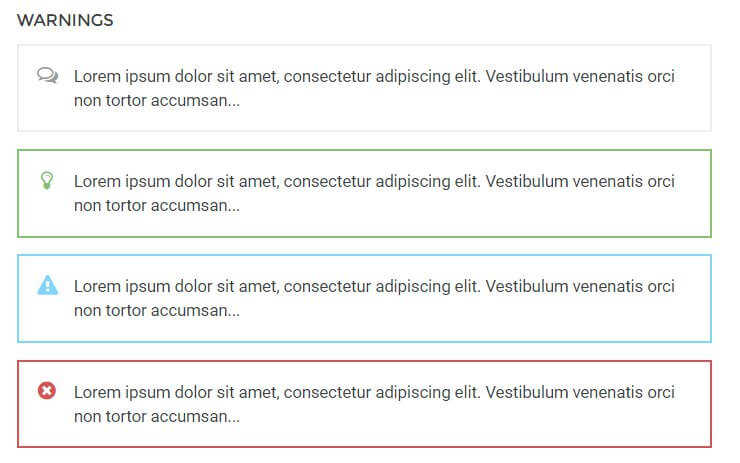
- alert info - This attribute adds a grey border around the the warning text and prefaces it with a speech-bubble icon to highlight information.
- alert success - This attribute adds a green border around the warning text and prefaces it with a lightbulb icon. It is useful for adding advice or hints to your content.
- alert notice - This attribute adds a blue border around the warning text and prefaces the text with an exclamation mark icon in a warning triangle. It is used for warnings or important notices.
- alert error - This attribute adds a red border around the warning text and prefaces it with a red cross icon; useful for negative messages or warnings.
Highlights
Highlights are a way to make a particular part of a paragraph stand out. Unlike the warnings, highlights can be applied in the middle of a paragraph without damaging the text layout.
To use highlights, you will need to add a set of <span> tags in your <p> tags to separate the phrase, and add the highlight class to the <span> element. For example, if you wish to add a highlight to the word "highlight" in the following <p> tag:
<p>This is a highlight phrase</p>
You would need to add the opening <span> tag with the highlight class before the word "highlight", and the closing </span> tag after, like this:
<p>This is a <span class="className">highlight</span> phrase</p>
The available highlight classes are:

- highlight - This highlight adds a yellow background to the text.
Code Listings
Code listings create blocks that separate code content away from the main content of your site, making it easy for users to spot and read your code:

Creating the code block is easy; simply surround the text/code you want to separate with a set of <pre> tags:
                    <pre>
                    #wrapper {
                         float: left;
                         display: block;
                         }
                    </pre>
Unordered Lists
Unordered lists are just that; lists with no particular ordering i.e. no numbered or otherwise ordered entries. This is a good way to list points or minutes in an easily-readable format.
The classes for styling the unordered lists should be added in the opening <ul> tag that begins with list, with the <li> list item tags left as they are:
                    <ul class="className">
                    <li>Item 1</li>
                    <li>Item 2</li>
                    <li>Item 3</li>
                    </ul>
There are four available unordered list classes, as follows:

- no class - The standard unordered list uses solid black dots as the delimiter between each point.
- list-1 - This class uses black tickboxes as the delimiter to each point.
- list-2 - This class uses black star outline icons as the delimiter to each point.
- list-3 - This class uses black right-arrow icons as the delimiter to each point.
Number Blocks
Number blocks create circles with a character inside, such as a number, followed by a text. They are useful for highlighting larger points or available options.
The complexity of the number blocks means that they require some more complex HTML tags. Each block contains a <p> tag, which also has the class assigned to it, and a <span> tag that contains the character to appear in the block, with the text following this before the closing </p> tag. The basic structure looks like this:
                    <p class="className">
                    <span>Character (i.e. "1", "A")</span>
                    Item Text
                    </p>
The classes available are:

- numblock - This creates a blue-colored colored circle and character inside.
Blocks
Blocks are ways to frame text to draw attention to it, either by adding colored backgrounds or outlines.

Creating blocks for your text is very easy; a basic <p> tag with a class added is all that's required:
<p class="className">
...with one exception, the Legend block, which we'll look at in a moment.
The available classes for blocks are:
- block-1 - This class adds a greyish-green background to the text.
- block-2 - Similar to the above class, but this time using a yellow background.
- legend - Creates a black outline around the text with a Legend or user-defined label at the top-left of the block.
For the legend block a different format is used due to it requiring a title. For this, a <div> should be created with the class name attached, then <h4> should be used for the block title, and standard <p> tags for the text:
<div class="legend"><h4>Title Here</h4><p>Text here</p></div>
Blockquotes
Blockquotes allow you to elegantly highlight quotations in your article. The blockquotes format consists of a <blockquote> tag containing a <p> tag that in turn contains the quoted text.
                    <blockquote;>
                    <p>Your Quote Here</p>
                    </blockquote>
There is one blockquote type included in Box, that is used by default whenever the <blockquote> tag is used in your HTML code.
Floated Blocks
Floated blocks are some of the most visually-appealing typography options available in Ecommerce. They allow you to highlight particular phrases or quotes from the text by adding them in colored text on the left, right, or centre of your main content, much like a newspaper.
The layout of the HTML tags for floated blocks depends on the type of floated block you are using, and where you want the block to appear. The text to appear in the floating block is defined in a <span> tag within your content. Content added before the <span> tag will appear above it, and content added after will be added alongside it. A standard piece of HTML using these blocks may look something like this:
                    <p>Lorem ipsum dolor sit amet, consectetur adipiscing elit. Vestibulum condimentum pulvinar justo, sed faucibus ligula feugiat ac. Morbi quis enim nulla, vel congue augue. Duis quis quam sed purus porta eleifend.

                    <span class="gk-block-text-left">Lorem ipsum dolor sit amet, consectetur adipiscing elit.</span>

                    Donec eget dignissim augue. Donec ante felis, aliquam ut consequat eget, lobortis dapibus risus. Aliquam laoreet enim et lectus ornare hendrerit. Aliquam rhoncus enim libero. Morbi aliquam, nibh mattis feugiat dapibus, nisi massa adipiscing justo, sit amet condimentum urna ipsum et lacus. Nam fermentum, eros quis ullamcorper convallis, libero mauris lacinia eros, sed tempus leo lorem vitae purus.</p>
Something to note here is that there is no set position for the <span> tag to be added; it should be placed organically at the end of a paragraph or line in the text to highlight a particular phrase. Use the preview option in WordPress as you write the content to see how it looks and make your decision from there, and experiment with the <span> tag placement; you will get the feel for your preference very quickly!
There are a total of two classes for floated blocks:
- block-left - This class aligns the text in the <span> tag to the left, with text following the tag appearing to the right.
- block-right - The same as the above class, except this time the <span> tag text is on the right, and the main content after the closing tag floating left.
Large Images in Articles
The standard blog layout included in Box usually uses two image sizes; a large header image, a smaller images in the content. However, Box also includes a special class for inserting images that are smaller than the header, but larger than the standard image in articles. To utilize this feature, simply add the gk-big-image class to your <img> tag:
<img src="/X" class="gk-big-image" alt="test" />
Two-column paragraphs
To make your articles more readable, at times you may want to split a paragraph into two columns instead of the usual one, as seen in the demo blog posts. To do this, add a double class to the paragraph you wish to display in two columns, newspaper-style:
<p class="double">Text goes here and will wrap automatically</p>
Font Awesome
Font Awesome is an incredibly useful font for delivering scalable icons to your site. With over 500 icons available covering a wide range of topics, from popular social media icons to transportation and payment icons, there's something for every type of site available.
How It Works
Font Awesome functionality is included as standard in the Gavern Framework, so you can start using their icons immediately. Icons are added to content using an icon <i> tag with a particular class attached that corresponds to the icon you want to display.
Every icon in the Font Awesome set has a class name beginning with fa, such as fa-pinterest for the Pinterest icon. To use an icon, this class name must be inserted into the <i> tag using the following format:
<i class="fa fa-ClassName"></i>
Notice that fa appears twice in the class attribute; the first time to declare the use of Font Awesome, and the second time as part of the icon's class name. For example, to insert the Pinterest icon mentioned above, the code would be:
<i class="fa fa-pinterest"></i>
A full list of available icons and their respective class names may be found on the Box demo's Typography Page .
The tags should always be left blank, with no text between the opening and closing tags. You may insert these tags anywhere you are entering standard HTML content, including any of our frontpage sections, or in your pages and posts.
The WYSIWYG (What You See Is What You Get) Editor that is used by default in Joomla!will usually clean up blank tags in articles; that is, tags with no content between them. This will include <i> tags that create Font Awesome icons, since they do not have any text between the opening and closing tags. To counter this issue, make sure to only use the plain text editor when adding icons.