Mobile layout broke

Support desk for Multipurpose Quark Theme
GK User
Sat Jun 18, 2016 5:14 pm
Hi,
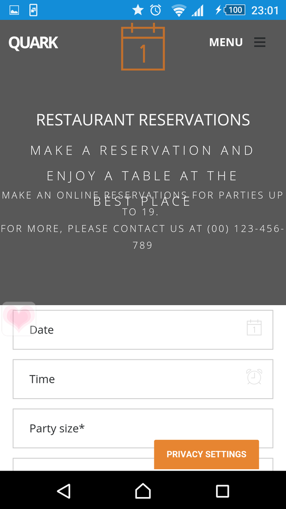
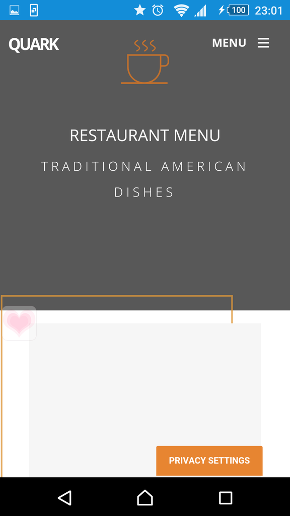
I've just installed Quark Restaurant on my site: http://evastudio.vn. Everything looks ok on PC, but when browsing on mobile, the header layout broke, texts flow like a mess (things are ok on demo site). This happens to both on my live site and testing on localhost. Some screenshots below:
Homepage:
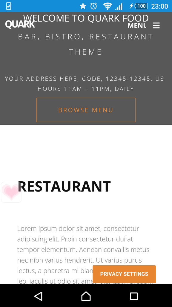
Image
Booking page:
Image

Menu page:
Image

Please help!
User avatar
Expert Boarder

GK User
Mon Jun 20, 2016 6:16 pm
Moderators are all on vacation???!!!
User avatar
Expert Boarder

GK User
Thu Jun 23, 2016 7:13 pm
The same problem after upgrading the template!
User avatar
Fresh Boarder

GK User
Sat Jun 25, 2016 2:31 pm
Seems like nobody helps us.
User avatar
Expert Boarder

GK User
Sat Jun 25, 2016 2:50 pm
Is anybody there?!
User avatar
Fresh Boarder

teitbite
Tue Jun 28, 2016 4:58 pm
Hi

Please do not bump threads. Moderator tool only shows a date of last activity so each bump moves question to the end of the line.

I'm gonna report this to programmers and will let You know about a fix as soon as they will answer me.
User avatar
Moderator

GK User
Wed Jun 29, 2016 4:36 pm
Hello teibite
Now i know we are in good hands!
Thank you
User avatar
Fresh Boarder

teitbite
Sat Jul 02, 2016 11:35 am
Hi

I need one of You to make a small test. Start with a site backup (Akeeba Backup will do or a copy of template'e CSS folder). Please go to template settings and enable "Recompile LESS", than refresh Your site. Check if this helped and disable "Recompile LESS". Let me know what happened, it helped with our copy of installation.
User avatar
Moderator

GK User
Mon Jul 04, 2016 2:24 am
Hi teitbite, that worked for me, everything looks AOK now!
User avatar
Fresh Boarder

teitbite
Thu Jul 07, 2016 12:12 pm
Hi

Ok great to hear that @ImaginariumIT. Can rest of Yu confirm it worked for them as well so I'll be able to close this thread ?
User avatar
Moderator

GK User
Tue Jul 19, 2016 12:03 pm
Hello
The test page is here
http://tavernavacadascordas.com/test/
Did not resulte.
Can i send you a private message with acess to administrator?
User avatar
Fresh Boarder

teitbite
Sat Jul 23, 2016 7:52 pm
Hi

Yes @profsilva please send me an access to joomla panel. I'll see why it's not working for You.
User avatar
Moderator

GK User
Fri Jul 29, 2016 4:15 pm
Hi Teibite,
That works for me. Eveything's ok now! You can close this thread.
By the way, sorry for bumping. I just worried that no moderator see my post.
Thanks again!
User avatar
Expert Boarder

teitbite
Mon Aug 01, 2016 7:29 pm
Hi

I will not miss it for sure, just need to answer the longest waiting first and with bump question is moved to the end of the line since it's ordered by the time of last activity.
User avatar
Moderator

GK User
Wed Jan 25, 2017 12:12 pm
I have the same problem here.
All is OK on desktop view, but on mobile it gets disturbed.

Then I went on template demo page and saw the same problems. I changed multiple phones and browsers, but obviously problem is in the template. Any sugestions?

Link: https://goo.gl/KcCFNN
User avatar
Senior Boarder

teitbite
Tue Jan 31, 2017 12:19 pm
Hi

In template settings You will find settings for header. Simply set more height for each mentioned device to fit everything there. I see 460px works pretty good for tablets and phones.
User avatar
Moderator

GK User
Tue Jan 31, 2017 6:37 pm
OK...
I haven't seen answer with "Recompile LESS". So I tried that and everything now works just fine.
User avatar
Senior Boarder

teitbite
Sun Feb 05, 2017 2:54 pm
Hi

Ok. I thought it's a leftover after recompiling LESS. Great to hear it's solved.
User avatar
Moderator


cron