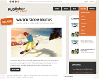
This article contains the configuration details for the Publisher theme. Using these information you can configure your theme when you cannot use the Quickstart package. Please remember that some details like the theme settings can be imported directly as the JSON file, what is faster than the manual configuration.
Theme Settings
IMPORTANT! Remember that you can import/export the theme settings using the import/export page.
File with exported settings for the Publisher Theme is available here.
- Advanced
- Back-end Branding
- Basic
- Fonts
- Layout
- Navigation
- Pages
- Seo
- Shortcodes
- Socialapi
- Theme Branding
Fonts configuration
- Body
- Main font used in the theme
- Type: Standard fonts
- Value:
Arial, Helvetica, sans-serif
- Selectors:
body,
.box .header > small,
.gk-menu .submenu a,
.box .gk-nsp-header,
.box .gk-nsp-link-header,
#main-menu > li > .sub-menu a,
#gk-bottom2 h4.gk-nsp-header
- Headers
- Font used for the headers
- Type: Google Web Fonts
- Value:
http://fonts.googleapis.com/css?family=Exo:300,400,600,700
- Selectors:
h1, h2, h3, h4, h5, h6,
#gk-logo.text,
#gk-user-area,
#main-menu,
.box .box-title,
article > header > time,
.btn,
button,
.button,
input.button,
button.button,
input[type=\"submit\"],
input[type=\"button\"],
#comments article .author,
.big .gk-nsp-header,
.big .gk-nsp-link-header,
.gk-legend > strong:first-child
- Others
- Font used in the other theme elements
- This font group isn't used.
Available Widget Areas
Widget areas available in the theme.
Available Widget Styles
Widget styles available in the theme.
Used GavickPro Widgets
The Publisher theme contains five built-in widgets which can be used for generating content on your website:
Widget settings
Below you can find list of the Widget Areas available in the Publisher theme which contains widgets in the demo content configuration:
