Adjusting the color scheme of your Joomla template
Color is an emotional language; people take advantage of colors to strengthen their messages and convey emotions in natural interactions. For example: we use warm colors to maximize emphasis.
You have to know that finding a complementary color scheme to work with your photos is a simple way to make the perfect template.
In color theory, a color scheme is the choice of colors used in design for a range of media. A color scheme is based on analogous colors. As a web designer, color management should be an important part of your workflow.
You can modify the color scheme of any Gavick template. Say, for example, that you frequently use the same design template and you want to make it look a little different by changing the accent color or the background color using CSS.
The tools below should help you decide which color to choose:
Create color scheme based on logo or any image
If you don’t have the talent to use the color scheme tool – then check color schemes tools based from the color of your logo
or any other image you can use:
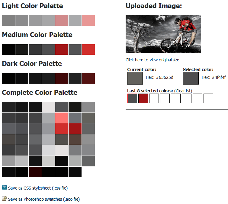
and upload there your main image or logo – you will get a color palette that matches the image.

Color scheme based on slideshow image from GK BikeStore template
This is useful for coming up with a website color scheme that matches a stock photo or logo a client wants to work with. Every one of your precious logo/picture contains a collection of pretty pixels which contain varying shades of red, green and blue. Color schemes are a great source of inspiration for web designers.
This article was first published
