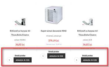
Aligning the cart button in the VirtueMart Joomla extension’s product view
If you’ve had enough of the “add to cart” button in Virtuemart’s category layout view being out of alignment – try these effective solutions to make a horizontal alignment constant.

- You have to always add a product title that is longer than one line.
- Or you have to use CSS to standardize the title block height.
h3.catProductTitle { height: 40px; overflow:hidden }
This article was first published
