Gavern 3.x – Layouts
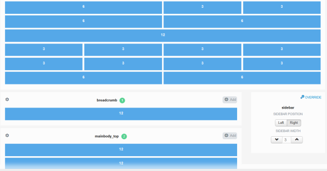
One of the greatest changes in Gavern 3.0 is redesigned ‘Layouts’ tab. This part brings more functionalities and improvement user interface in managing template layouts.


This Layout tab (section) is divided into four parts:
- Select device (desktop, tablet and mobile)
- Template width
- Template columns
- Sidebar override
Template width option allows a user to specify width of the template, this value can be set in percents or pixels. In the first case, template width should be given with ‘%’ suffix like: ‘98%’. When you set the template width in pixels, please remember to add ‘px’ after number value. (e.g. ‘1020px’)
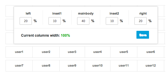
Template columns area can be used for setting different width for every template position. All values in this form are set in percents and have effect to a whole template.

To specify width for particular template positions, a user needs to click on a proper position name in a simplified module positions grid area, then every module position width in selected row can be changed. To save changes, users need to click ‘Save’ button after every change made. Remember, a sum of percentage values in every row should be equal 100%, so please check whether a pop-up window shows a message: ‘Current columns width: 100%’ in every row to avoid further layout problems.
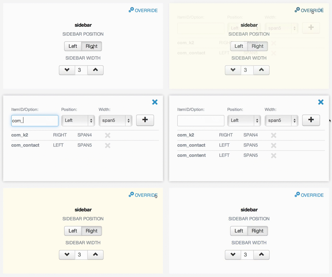
Sidebar override – this option allows personalization the sidebar’s position, depending on the option (e.g. com_k2) or menu item ID – ItemID (e.g. 101). The new sidebar’s options allow not only changing its width but also its position (left, right). Due to the new functionality, the sidebar’s appearance in Layout Manager window has changed: a selection of the Override option shows a list of rules created; there is an option to add new rules or remove the existing ones.

The very latest version of Meet Gavern is available at GitHub repository and may also be found in our download section.
This article was first published
