Gavern Joomla template framework: Layout Manager Tutorial
With the 1.2 release of Gavern, we have completely redefined the way modules are managed within module positions in our templates. With this release, all layout features are included in one field: the Layout Manager.
Layout Manager allows users to accomplish the following:
- specify the number of modules to be placed within a module position;
- set the width for modules using bootstrap spanX classes (form span1 to span12);
- set any of the above options for either tablet/mobile or desktop mode;
- set sidebar position and width;
- import module position settings from another module;
- disable the Layout Manager settings for a particular module position and use the Joomla! module configuration instead; and,
- set the default module width when module size is not set via Layout Manager.
Layout Manager is divided into two basic parts :
- A layout switcher with desktop, tablet and mobile options, and
- Module positions preview with all related features.
Layout switcher
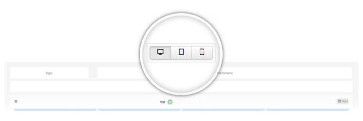
The layout switcher permits users to preview changes to the site interface based upon the screen resolution when one of the available modes (desktop, tablet or mobile) is selected. It is also possible to set different width values for desktop and tablet modes. By default, all modules in mobile mode are set to 100% width. Please remember that this is only a sample preview and that the final template layout may be different in some respects. Users don’t need to save changes before changing mode; all settings will stick until a user either saves the template configuration or cancels it.
Module positions manager
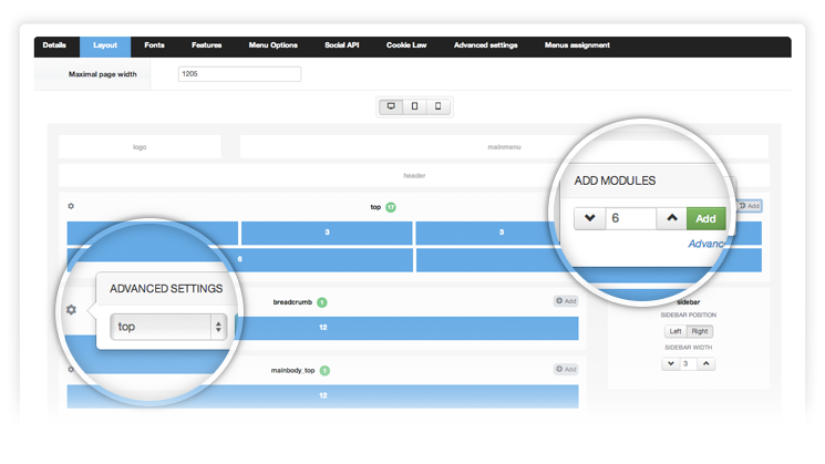
In this area you can preview the template layout. Basically, blocks are divided into two groups:
- active blocks – here you can add modules, set dimensions etc.
- inactive blocks – these are template-reserved module positions such as menu, logo, social blocks etc., which will always display in the same location.
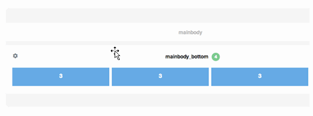
Active blocks represent template module positions. In this area, users can add settings for particular modules.
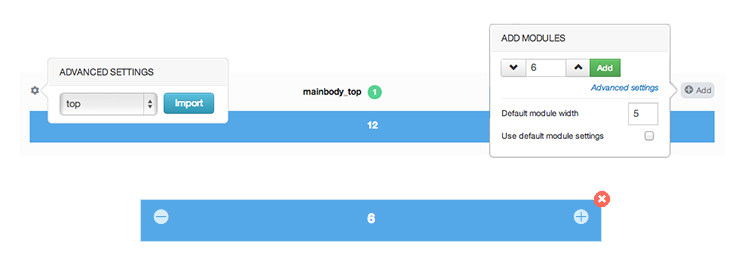
- Advanced Settings/Import – here users can import configurations from different module positions
- Module position name
- Number of modules assigned to a module position
- Add modules
- Module width with “Add” button
- Advanced settings:
- Default module width – value to be set as the default width for every new module not included in Layout Manager. For example, when a user creates 3 modules inside a module position and for the front-end publishes 5 modules, the 4th and 5th modules will each get a span5 width value
- Use default module settings – with this option enabled, Layout Manager will not affect the selected module; instead, settings are applied from the module configuration
Sidebar is one of the module positions offering various options:
- Sidebar position – choose between left or right values
- Sidebar width – width value for sidebar area; changing the sidebar width also changes the mainbody area width
After adding a new module to a module position, the element is presented by a simple block:
- Decrease width button – decrease module width by (the minimum amount is 1 and the maximum amount 12)
- Current width value
- Increase button – increase module width by 1
- Remove button – remove added block
Sample configuration
This part describes a sample module position configuration. For this example, we’ll select ‘top’ module and specify the following module layout in this position. For this tutorial we assume that we will have 6 modules in this area:
- in desktop mode : span 6 | span 3 | span 3
span 6 | span 6 span 12
- in tablet mode : span 6 | span 6 span 4 | span 4 | span 4 span 12
- in mobile mode all modules will have 100% width so it will look like :
span12 span 12 span 12 span 12 span 12 span 12
The first thing to do is to add the assumed value of modules to Layout Manager. To do this, choose the module in desktop mode, select the “Add” button and add modules with following widths – 6,3,3,6,6,12.
On sample preview the layout should be similar to what you need. Next we go to tablet mode, using the mode switcher at the top to make corrections for particular module blocks.

The first one is fine because in both tablet and desktop modes the module should have a value of span6. In the second module we increase the width from 3 to 6. For the third one we’ll increase from 3 to 4. Then the 4th should be decrease from 6 to 4. Similar process we repeat for other modules five and six. Now it is time to save template configuration.

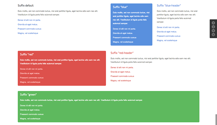
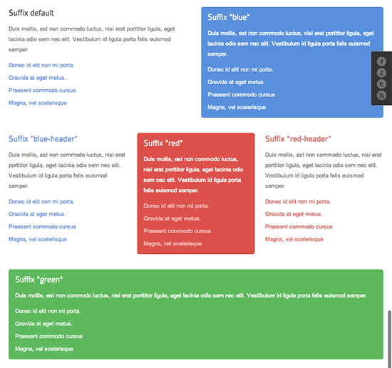
After saving configuration the results should be visible at front-end, depends of screen resolution when the tablet or desktop version is loaded modules should be displayed similar to Layout Manager preview.
Desktop :
Tablet :
This article was first published
