Mobile Layouts in the Gavern Joomla Template Framework
Before RWD became popular in our templates we used mobile layouts. The requirements for mobile versions of Web pages are quite specific. To address this, we offer some template options specifically designed for the mobile version pages:
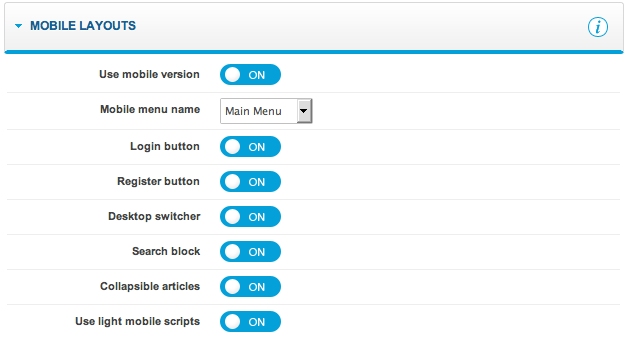
Now, the mobile version loaded on iPhone and Android devices is not separated into two layouts but it is just one called ‘Handheld’. Mobile layout settings are listed below :
- Mobile menu name – defines the Joomla! menu loaded in mobile versions
- Login button – enable/disable login button
- Register button – enable/disable register button
- Desktop switcher – enable/disable displaying ‘Switch to mobile’ and ‘Switch to desktop’ links in desktop/mobile layouts
- Search block – show/hide search field
- Collapsible articles – when this option is enabled articles on frontpage are collapsible to display more content in pages
- Use light mobile scripts – allows user to choose between lightweight mobile scripts build with Zepto.js library or to load mootools scripts with all desktop features
The most significant change is the ability to specify a menu specifically for the mobile version of a page, using the Mobile menu name option. This ensures certain subpages will not be displayed as they would not work correctly on mobile devices.
We can also switch on or off certain elements of a page’s mobile version as per the following:

A page’s mobile version offers two module positions: mobile_top and mobile_bottom, and a standard location for component and system messages.
The most interesting option allows blocks of articles to be rolled-up; this option works with iOS and Android systems only.

Improved Menu
There has generally been a lack of submenu support for the mobile versions of templates. GavickPro is pleased to announce that we have overcome this limitation! From now on, clicking (or even touching) a menu position – including that of a submenu – will display a submenu; a button will appear to return to the previous menu level. See the following images:


This is an example of why it is necessary to have a separate menu for the mobile version of a page; without this, we could not directly access the menu position which includes the submenu. We recommend creating such submenu positions as separators.
CSS for Mobile Versions
Creating functionality to generate Web pages compatible with mobile devices was an interesting experience for the GavickPro team, but it can become irritating after some time. As a result, we decided we wanted to determine the quickest way to create them.
Our use of CSS files to create a separation between regular pages and those to be modified became key. We also set our sights on creation of a universal .PSD file for mobile versions of templates for which appropriate images could be generated, as well as the ability to specify pixel and template color values. In the end, the results of our work makes updating mobile templates much easier.
This article was first published

